Saturday 21 November 2015

Is this the shortest abstract ever?

I’m currently writing a new program as part of a comparative genome analysis, which has the working title of “Snapper”. Unusually (but not uniquely) for me, this is not an acronym, but is instead a simple contraction of “SNP Mapper”.

Before doing too much, it is always wise to check for existing tools with the same name, especially if they might do similar things. A quick Google search for “Snapper bioinformatics” threw up this paper:

  • Kolesov G, Mewes HW & Frishman D (2002). SNAPper: gene order predicts gene function. Bioinformatics 18(7):1017-9.

The abstract:

SNAPper is a network service for predicting gene function based on the conservation of gene order.

AVAILABILITY:
The SNAPper server is available at http://pedant.gsf.de/snapper. SNAPper-based functional predictions will soon be offered as part of the PEDANT genome analysis server http://pedant.gsf.de.

I know that Bioinformatics application notes are pretty concise - the idea is that the described software has the documentation you need - but that has to be one of the shortest abstracts that I have ever seen!

SNAPper itself is not an acronym, although the SNAP part is: Similarity Neighbourhood APproach. For such a common acronym as “SNAP”, that one needs some work, I think.

PEDANT, on the other hand, is a full ORCA-worthy acronym: Protein Extraction, Description and ANalysis Tool. It reminds me a bit of a defunct classic of my own, PIRATE: Protein Identification, References, Annotation and Tissue Extraction (or something like that, lost in the mists of time) that was basically just a parser for Uniprot entries that tabulated certain data, after I discovered that a PhD student in the department had spent several days copying and pasting data from Uniprot into Excel. Happy days!

Tuesday 17 November 2015

Creamy mustardy lentils with bacon and squash

This is another repeat favourite, based on a Waitrose recipe, Rosemary-roasted squash with ham hock and lentils. Aussies are more into cow than pig products, so it’s not so easy to get decent ham/bacon etc. However, this recipe does just fine with some fried bacon chunks rather than the (cooked) ham hock in the original. The original also used frozen squash.

You can pre-roast the squash for this recipe.

Ingredients

  • ~1kg Butternut Squash
  • 2 sprigs fresh rosemary, chopped
  • 250g puy Lentils
  • 1 tsp olive oil
  • 1 small onion, finely chopped
  • 1 tbsp Dijon mustard
  • 100ml Single Cream
  • 180g pulled ham hock or cubed bacon
  • 25g sunflower seeds
  • 20g pack flat leaf parsley, chopped
  • 100g frozen peas

Instructions

  1. Preheat the oven to 200C, gas mark 6. Cut the butternut squash into large chunks (e.g. quarters) and spread in a single layer on an oiled baking sheet. Sprinkle with the chopped rosemary. Bake for around 45 minutes until tender and lightly browned, tossing in the oil about halfway through. Cut into something resembling even cubes. Bitesize chunks, if you will. (Don't obsess too much - there's a chance the squash will, well, squash to mush anyway.)

  2. Cook the lentils in a pan of boiling water for 15–18 minutes until tender. Drain.

  3. If using bacon, fry the bacon cubes in a bit of oil until cooked.

  4. Heat the oil in a large non-stick frying pan and cook for 5–10 minutes until good and soft.

  5. Stir in the mustard, cream and some seasoning and bring to simmering point.

  6. Stir the cubed squash, drained lentils, bacon/ham hock, sunflower seeds, parsley and peas into into the cream sauce.

  7. Heat through gently until everything is hot.

  8. Check seasoning and serve.

Tastier than it looks (with my food photography skills, at least) and makes good leftovers too.

Sunday 15 November 2015

Humpbacks ahoy! Whale watching off Sydney

We’ve been meaning to go whale watching since we moved to Sydney and today we finally got round to it. The weather was not the best - and the sea was a bit choppier than ideal - but it was a fantastic morning, well spent. Best of all, we got to see humpback whales!

It was only a small pod - a mother and calf, plus “escort” - but we got some reasonably close up views when one of them was having a play.

As well as a couple of breaches, this included a couple of good tail slaps.

Amazing animals. We saw some birds too - and, of course, some great views of the cliffs around Sydney harbour. All in all, a recommended half day trip.

Monday 2 November 2015

ICBCSB 2015: Another scam conference comes to Australia

I am a bioinformatician working in Sydney, Australia. I recently helped to organise the ABACBS2015 conference in Sydney, where ABACBS stands for the Australian Bioinformatics And Computational Biology Society, of which I am a member. I am also part of the New South Wales Systems Biology Initiative. You may therefore find it surprising to know that I found it surprising to find out that in December, Sydney NSW will be host to "ICBCSB 2015 : 17th International Conference on Bioinformatics, Computational and Systems Biology".

This is not the only surprising thing about ICBCSB 2015. For Sydney is actually at least the 15th 17th International Conference on Bioinformatics, Computational and Systems Biology (ICBCSB 2015). Next week, the conference is being held in Madrid. Last month, there was the 17th International Conference on Bioinformatics, Computational and Systems Biology in Bali. And Prague. And Chicago. And Istanbul. The 17th International Conference on Bioinformatics, Computational and Systems Biology (ICBCSB 2015) has also been in Venice, London, New York, Berlin, and Geneva and will be held in Penang and Dubai. And that’s just in the first two pages of a Google Search - there are more (including Lisbon and Stockholm).

This makes OMIC Group Conferences look positively legit. Indeed, the organisers of all 15+ ICBCSB 2015 conferences - the World Academy of Science, Engineering and Technology (WASET) - seem to be basing their conference business model on that of OMICS. Or perhaps it was the other way round. Either way, if you replaced the WASET logo on the website with OMICS Group, nothing would seem out of place.

If you have ever attended a (real) scientific conference, pick one of those past conferences at random, for example Berlin, and click on the conference photos page, then tell me if you have ever seen anything so depressing in your life. And remember: these are the photos they chose to put up, so presumably show the conference in its best light. Given the number of group photos of (all?) the delegates, I wonder whether they had time for much else other than publicity shots. And in case you are thinking: “those are probably just the invited speakers”, I would bet good money that the delegates were all invited - and still had to pay top dollar to attend.

Finally, in case you have any doubt, just Google “WASET scam”. It does not make for happy reading.

If you are in bioinformatics or systems biology, please spread the word far and wide about these conferences and why they should be avoided at all costs. The sooner we starve the likes of OMICS Group and WASET of naïve unsuspecting scientists to prey on, the sooner these parasites will f#@k right off. There are plenty enough legit conferences to choose from. (Yes, it makes me angry.)

And if you have already signed up for Sydney ICBCSB 2015, do not despair. As luck would have it, there is a real bioinformatics event being held in Sydney that same week: BioInfoSummer 2015. It’s more of a workshop than a conference but there will be plenty of opportunities to discuss science with some excellent bioinformaticians and systems biologists. At least that way, you won’t waste the plane ticket and hotel costs, even if WASET won’t give you a refund for pulling out. (Not likely!)

Sunday 1 November 2015

A tale of two conferences - #ABACBS2015 and #AGTA15

Two weeks ago, I attended the awesome double-header of ABACBS2015 and AGTA15. In some ways they were chalk and cheese - ABACBS was cheap and cheerful, where as AGTA was expensive and (therefore) exclusive - but both were great and highlighted some of the very best features of successful academic conferences.

As part of the ABACBS2015 organising committee, I needed to collect my thoughts for a debrief, so I thought I’d got down some thoughts here. (Thanks to grant writing, the post itself got a little delayed!) As with biology itself, most decisions are trade offs and the following comparison is not to criticise - I just find it interesting. As with the awesome ABiC14 conference last year, I mainly want to document good practice for future reference. (Some of these will no doubt be repeats of my ABiC14 thoughts!)

Size. Both conferences were, for me, the perfect size - around 180-190 people. This is enough to give the conference a good buzz and ensure that there are sufficient interesting people to listen to and posters to visit. Critically, though, it was small enough that you could find and speak to the people you wanted to. (Even if I didn’t fully get the chance at ABACBS2015 because I was busy, and managed to miss some people at AGTA15 because time ran out!)

Venue. ABACBS2015 was run on a budget and we were very fortunate to have the Garvan Institute provide a free venue for the conference. The Garvan lecture theatre is lovely, with a great AV system and comfy seats. The only negative for a conference of that size - and we got close to our 200 person limit - is that the space outside the theatre for breaks and posters does get a bit cramped. In contrast, AGTA15 was held in the Crowne Plaza at Hunter Valley, which is a pretty luxury hotel in the wine region of New South Wales. It took me a while to warm to the main conference setup, with seats around tables in a large, wide room with a screen each side of (and a long way from) the podium. However, the “trade exhibition” space where the breaks, lunch and posters were, was excellent. I am big fan of having the posters up all the time and in the same place as the breaks.

Location. ABACBS was held in the city centre at a research institute. This kept the costs down and made it easy to get to. (We did not organise accommodation.) It also made it easy to escape from, which might have affected evening social numbers. AGTA was out in the sticks, which made it harder to get to and may have put some people off attending - it essentially added another day to the length of the conference. The plus side of this was that everything was on one site and it was not so easy to disappear or go home, and so most people were around most of the time, I think. (Although there was the temptation of wine tasting on the doorstep!)

Goodie bags. I’m pleased to say that both conferences went down the reusable shopping bag route (pick above). Being budget, we got UNSW to sponsor us with some canvas bags for ABACBS. (Complete with the scary statistic that plastic bags take 15-1000 years to break down.) AGTA was (a) a bit more upmarket and (b) in wine country, so they provided wine coolbags!

Trade exhibition. We binfies are a cheap lot - and I don’t mean tacky or miserly, I mean that we don’t need a lot of money to do great things. As a result, it is hard to attract trade sponsors: we just don’t spend (or often even have!) any money! Genomics is clearly a different matter, as you literally cannot do it without lots of expensive kit. The AGTA trade exhibit was therefore pretty big and bustling. Again, putting it with the food and posters made for some great…

Breaks. Breaks really do make or break a conference. One of the few criticisms of ABACBS2015 was that the breaks were a bit too short - we were somewhat hemmed in for time because we needed to leave people enough time to get to AGTA in the afternoon of the second day. We also tended to over-run a little, because people would be enjoying the breaks and take a bit of time to filter back into the theatre for the talks. My advice for conference planners: (1) make all breaks 5-10 minutes longer than you think they should be (e.g. 40 minutes for coffee and over an hour for lunch); (2) build in some dummy time into the program to soak up delays; (3) Make sure you have a bell or something to signal that the next session is starting! Being a more leisurely multi-day conference, AGTA had nice long breaks, including a session off for posters etc. after lunch. Lots of opportunities for mingling and looking at posters.

Invited speakers. Both conferences had outstanding invited speakers that gave really interesting talks. I know some of the binfie crowd would have enjoyed a bit more about the methodology in ABACBS2015 - and we should perhaps brief our speakers a little better in future - but personally I was blown away by the quality of the science presented. Both fields are rapidly changing as technology opens up opportunities and there is some really cool stuff going on out there! AGTA in particular seemed to have a lot of invited speakers, talking about really cool stuff - possibly part of the reason it's so expensive. (It must be said: the quality of the selected abstracts was good too!)

Gender Equality. Both conferences did pretty well on the gender front, I think. ABACBS2015 in particular nailed it, with a 50% split of invited speakers and over 50% female speakers overall! (The latter wasn’t deliberate as such - there are just loads of good female bioinformaticians in Australia who submitted interesting abstracts!)

Twitter. (And #confBingo.) I have mixed feeling about live tweeting at conferences. This year, I decided to throw myself in a bit more and, on balance, I feel that I got more out of it than I missed. It is true that sometimes I missed something a speaker was saying because of a tangential Twitter conversation (such as #JediKelpie) - but I also learnt stuff and picked up on things that I had missed thanks to the Twitter feed. The #confBingo thread was also quite entertaining a fun, and helped networking and building community spirit, which is what a lot of a good conference is ultimately about.

Coffee. Unfortunately, we were unable to attract the barista sponsor from ABiC14 to sponsor ABACBS2015. AGTA did have a sponsored barista, though. Roche (I think) gave out three tickets with registration for the trade exhibit barista. Not quite as good as unlimited but it hit the spot. My other top conference coffee tip: bring a reusable cup! It' so much easier/safer if you want to take coffee into the talks and generally cuts down on spills - and refills! (Next year, I am hoping for ABACBS Keep Cups in the goodie bags!)

Overall, I had a lot of fun helping with the conference organisation - and would recommend it - and even more fun attending. Australia has some great science going on and a really strong/vibrant bioinformatics community, and I am proud to be part of it.

Quick and easy pasta with Italian sausage and kale

Coles magazine quite often delivers the goods in terms of convenient and tasty meals that I can actually be bothered to make - and are quite forgiving to deviations from the recipe. This is my variation on Curtis Stone’s “Penne with sausage and kale” from April 2015. I’ve made this a few times now, so it’s time to post it so that I don’t have to dig out the magazine. (Yes, I really am that forgetful!)

Ingredients

  • Coles finest Italian sausages. (Any tasty quality sausage will do but these have fennel in, which adds an extra dimension.)
  • Bunch of kale, stalks removed and sliced. (Recipe calls for half but I go for a whole bunch - it cooks down.)
  • 2-3 cloves of garlic, crushed.
  • Small/half glass of dry white wine.
  • Jar of tomato pasta sauce. (The recipe calls for 1.5 cups of passata but then you are left with lots of passata.)
  • 300g pasta. (Recipe says penne. I tend to use small spirals… for everything.)
  • Parmesan, salt, pepper to serve.

Instructions

  1. Get a large pan of salted boiling water going to cook the pasta. See below for the timing you’re aiming at. (Err on the side of too late, I think - the rest can simmer for a bit longer.)

  2. Remove the sausages from their skins and fry them over a medium-high heat, breaking them up with a wooden spoon/spatula as you go.

  3. Add the kale and garlic and cook until the kale is wilted. If you are using a whole bunch, like me, you may need to add it in a couple of batches - unless you have a very big pan. Don’t worry: it cooks down a lot.

  4. Add the wine and the tomato sauce. This time, we used puttanseca sauce, which was quite olivey. If olives aren’t your thing, you might be happier with a simple tomato or tomato and basil sauce. (You can just use passata as in the original recipe, of course!) The sauce had a few cherry tomatoes in it, which was nice. This recipe would work well if you roasted some cherry tomatoes and chucked them in too.
  5. Bring to a simmer and cook for a few minutes until at the desired consistency. Hopefully, your pasta should be done by now. Drain and toss with the sausagey tomato goodness.
  6. Season to taste and serve. Sprinkle with grated parmesan and black pepper. This makes enough for four adults, or two good dinners and lunches.

And, of course, it passed the Arthur test. (No, he didn’t get any.)

Saturday 31 October 2015

Happy Halloween

I can’t find the original at thepoke.co.uk but this made me laugh when it popped up in my Facebook newsfeed…

Saturday 17 October 2015

Second Aussiversary musings

Wednesday this week was our second Aussiversary, having stepped off the plane to start our new adventure two years ago.

To celebrate, here are some of things I have learnt over the past two years (in no particular order):

Comment below if you think I’ve forgotten anything important - I’m sure there’s lots!

Monday 24 August 2015

Take 3 for the environment

One of the organisations represented at last week’s Oceans of Plastic event at Taronga Zoo was Take 3:

The ‘Take 3’ message is simple: take 3 pieces of rubbish with you when you leave the beach, waterway or… anywhere and you have made a difference.

Marine debris, particularly plastic, has a disastrous impact in our oceans on marine life and, ultimately, us. We can greatly reduce the amount of marine debris in our oceans by preventing it from getting there in the first place! We encourage people to Refuse disposable plastic, Reduce, Re-Use, Recycle and Respond by picking up rubbish.

We want to educate the world about this complex problem by inspiring simple actions.

It really is a simple idea that can make a big difference: visit the Take 3 website to find out more. There’s also a bunch of videos at the site if you’re not sure why plastic is such a big deal.

Friday 21 August 2015

Bioinformatics is just like bench science and should be treated as such

A bad workman blames his tools. A bad life scientist blames bioinformatics. OK, so that’s a little unfair but so is the level of criticism levelled at bioinformatics by people who should know better. If you are a bioinformatician, it is inevitable that you will run up against the question of whether you ever do “real” science.

If you are unlucky, it will be as blunt as that. At the end of a bioinformatics seminar earlier this year, someone actually asked (in what was meant to be a good-natured way): “Is bioinformatics real? I give the same data to two different bioinformaticians and get completely different answers!” Often, it is is in the subtle form of: “are you going to validate that in the lab?” - as if validating it another way would not itself be valid.

If you are a bioinformatician and are asked a question like that, the correct answer is: it’s as real as [insert appropriate “wet” discipline of choice]. For bioinformatics is science and like all science it can be done well, or it can be done badly. It can generate meaningful results, or meaningless results.

If you want to get meaningful results, you have to treat it like a science, rather than a “black box” of magic. What do I mean by that? Here are my not-quite-buzzfeed-worthy, “8 shocking ways that bioinformatics is just like bench science”:

1. Experience and Training. You wouldn’t hand someone a wet lab protocol for, say, Southern blots, give them a key to your lab and say, “off you go” without first giving them some training and, preferably, the opportunity learn from someone who already knows the procedure. If you do, expect bad results. Bioinformatics is no different. Just because a two year old can work a computer these days, that does not mean that bioinformatics is easy. A two year can also press “Start” on a PCR machine.

2. Optimising your workflow. If you were doing a PCR, you wouldn’t just find a random paper you like that also did a PCR, copy the Mg2+ concentration etc. and then bung it in PCR machine and run the default cycle. Likewise, you should not just stick your data into a bioinformatics program and automatically expect it to do the right thing. Just as to be a good molecular biologist, you need to be (or know) someone who knows a bit of chemistry to understand what’s going on, to be a good bioinformatician, you need to be (or know) someone who knows a bit of molecular biology (and chemistry! and sometimes physics) to understand (a) the data you are putting into a program/workflow, and (b) what the best way to process that data is. If you make the wrong assumptions of your data, you will get the wrong answer. (And if different people make different assumptions, they will probably get different answers.) Computers just do what they are told - don’t blame them if you tell them to do the wrong thing. (It is also important not to get “target fixated” on perfect optimisation; just like for bench science, the performance of your bioinformatics workflow only needs to be as good as your experiment/question demands.)

3. Planning. You wouldn’t start a bench experiment without planning it first. Just because bioinformatics is not time-dependent, that doesn’t mean that you shouldn’t plan your analysis before you start. Know what your final output is going to be and work backwards. Making decisions as you go along is a great way to make bad decisions. Sure, have a play to work out how things work but then go back and do it properly from beginning to end.

4. Lab notes. You wouldn’t just stick a tube labelled “20/8/15 mouse 3 PCR” in the freezer and expect to remember what it was and how it was made 3 months later. Instead, you would (hopefully!) keep a meticulous record of primers and reaction conditions etc. in your lab book. Bioinformatics needs the same record-keeping mentality. Program version numbers, dates and settings are important. Write them down. You will almost certainly end up running an analysis more than once, and it won’t always be the last run that you end up using. You do not want publications to be held up because you are having to re-run your bioinformatics just to work out what settings you settled on.

5. Labelling. Even with a well kept lab book, you wouldn’t store samples or extracted DNA in tubes labelled “tube 1”, “tube 2” etc. for every experiment. If someone rearranges your freezer - or there is an emergency freezer swap following power/equipment failure - you could quickly get muddled up. Likewise, don’t call your files things like “sequence.fasta”. You’re just asking to accidentally analyse the wrong data. Include multiple failsafes so that if you enter the wrong directory, for example, your file names won’t be found. (A pet hate of mine is bioinformatics software that outputs the same generic file names each time it is run for lazy scripting.)

6. Reproducibility. Bioinformatics is - or should be - extremely reproducible in a trivial way. If you put the same data into the same program with the same settings, you should get the same answer. In this sense, it should have the edge over bench work - you do not need to repeat experiments. Right? Well, not really. Just because it should be consistent in how it goes wrong, you cannot be sure that a bioinformatics tool is not getting confused by some subtle nuance or peculiarity of your data. Try with another tool that does the same job, or change a setting that should make no difference, and check that you get qualitatively the same answer. (Better still, try changing a setting that should make a predictable difference and make sure that it does.) Just as you can get a misleading lab result if you mislabel your tubes or add the wrong buffer, you can get a misleading bioinformatics result if you mislabel your data or use the wrong parameter settings.

7. Validation. Bioinformatics often receives a certain amount of flak that it is not “real” and everything needs to be validated. This is true, up to a point. The forgotten point is that nothing is real and everything needs to be validated. In the lab, you rarely actually measure or observe something directly - you are inferring reality from things you can measure (e.g. fluorescence) based on what you think you know about the system (e.g. what you’ve labelled) and certain assumptions (e.g. lack of off-target binding). You then have to perform additional experiments - and/or bioinformatic analysis of your data - to test that your assumptions appear to be good and that there are not alternative explanations for your observations. Bioinformatics is no different. NO different. You make assumptions and you make inferences based on observed outputs. These assumptions and inferences need to be tested. This might be by “validation” in the lab. It might be by independent analysis of other data. The only reason the former is more common is that one often needs to generate new data, which clearly bioinformatics cannot do. However, if the data already exists, there is no reason why bioinformatics cannot be used to validate other bioinformatics, or even bench experiments.

8. Limits. Regrettably, bioinformatics is not a magic wand. (Sadly, we are not bioinformagicians.) It cannot correct poor experimental design. It cannot overcome a lack of statistical power. Just like at the bench, if you design an experiment poorly, include confounding variables or overlook covariates, you might not be measuring what you think and/or you might not have any signal from your analysis. It is tempting to think that bioinformatics is more limited that bench science because we cannot collect our own data, but this would be wrong. Bench data is the raw material on which bioinformatics is performed. We can collect new data from other data - much of sequence analysis is doing just this. Of course, if our particular study focus of interest has no data, we need to generate it. But if you want to study the affect of a certain drug on a certain cell line and either/both do not exist, you have to generate that too.

So, what can we do about it? Bioinformaticians have to take some of the responsibility, largely because we are the ones that write software that perpetuates the myth that understanding parameters is not important. What do I mean by that? Well, often the documentation or “help” for bioinformatics tools is poorly written and poorly maintained - if it exists at all. When it does exist, it is usually written with expert users in mind. The novice is flooded with parameters and does not know which ones are important, or when. One solution is to write a series of protocols in the same vein as bench protocols, highlighting when one might want to change certain parameters - and which parameters are most important. (I am no saint in this department, sadly. If nothing else, this post has made me more determined to do better.)

The bottom line is quite simple, though:

Bioinformatics is science. Full stop. It is no better than other science. It is no worse than other science. People do it right. People do it wrong. However, if you are worried that it’s not real, the chances are that either you are doing it wrong, or you have deluded yourself about the “reality” of observations from bench science.

Thursday 20 August 2015

A handsome beast

Today, I decided to take the day off and went to Taronga Zoo in advance of the Oceans of Plastic event. Like most people with an interest in conservation and animal welfare, I have mixed feelings about zoos. In an ideal world, we wouldn’t need them; unfortunately, we do not live in an ideal world and zoos are an increasingly important bastion of biodiversity.

They are also a place where you can go and marvel at nature. And what a marvellous chap this is:

How anyone can look at that and think, “I really must shoot that” (other than with a camera), is totally beyond me.

Wednesday 19 August 2015

Oceans of Plastic - Beat the Microbeads (and more)

Tomorrow (Thursday, 20 August 2015 6:00 PM to 8:00 PM (AEST)) there is a Taronga Zoo Science Week event at the zoo: Oceans of Plastic.

I’ll be helping set up through the Sydney Society for Conservation Biology and the event continues the theme of this month’s Conservation Cafe with Prof Emma Johnston, which was on human impacts of marine ecosystems. It was a really interesting morning, and I am looking forwards to learning more.

One thing that struck me that morning was how little I actually knew about the products I used and their impact on the environment. I was shamefully unaware of plastic microbeads in cosmetics like facewash, for example, which are a massive issue.

I’m even more ashamed to say that my (ex-)facewash is on the “Beat the Bead red list” as containing polyethylene (PE) microbeads. I meant to check after the Conservation cafe but completely forgot. This in turn reminded of something else I pondered that day, not just regarding plastic pollution: isn’t it time that we put more pressure on supermarkets to have environmentally aware labelling of products. We already have it for a few things, like tuna (and, sadly, the unhelpful blanket labelling of GM products), but there are so many different considerations - water, energy, waste etc. - that I feel like something more comprehensive is required.

They have asked for questions for tomorrow’s panel, so mine is this:

Could/should we have “environmental impact” traffic lights on goods in supermarkets, akin to the nutritional value traffic lights on food?

I’m not sure if it will get asked but I’ll be interested to hear the panel’s thoughts if it is.

In the meantime, Beat the Microbead have a Warning: Plastics Inside! App. The idea is that you scan or look up your products before you buy. (I tried it on my face scrub and the scan failed but it was in the lookup list.) Alternatively, just go old school and look at the ingredients! (The main ones are: polyethylene (PE), polypropylene (PP), polyethylene terephthalate (PET) and polymethyl methacrylate (PMMA).)

Anyway… if you are in Sydney and looking for a fun and informative (and cheap!) evening, you can get tickets for Oceans of Plastic on Eventbrite.

Tuesday 18 August 2015

OMICS Group conferences are still to be avoided at all costs

Regrettably, my most popular post of the week is pretty much always: OMICS Group Conferences - Sham or Scam? (Either way, don’t go to one!) [I’d much rather it was one of the evolution posts - maybe Artificial Selection versus Natural Selection.]

A few weeks back, I was contacted by an ABC journalist doing an investigation of OMICS Group conferences, which have been trying to break into the Australian market. The show, Predatory publishers criticised for ‘unethical, unprincipled’ tactics, is fully available (complete with transcript) and an interesting, disturbing and upsetting in equal measure.

In the end, I declined to do an on-the-record interview - as another anonymous academic on the show said:

“Having been duped, it is somewhat embarrassing and you don’t really want to wave that around too much on national radio. Yes, I don’t want to be known as someone who was so easily drawn in.”

Nevertheless, I am still glad that I wrote the post. Predatory publishers and conferences are a scourge on academia and need to be exposed. Hopefully, Hagar Cohen’s ABC show will help. (They seem to know their brand is toxic and now avoid using it in emails - but they are still easy to spot!)

Friday 7 August 2015

UNSW are robot soccer world champions!

Following the first the first innings performance of their cricket team at Trent Bridge, the Aussies need a sporting success story. Happily, the UNSW Australia Robocup team has been able to provide such a story.

Yesterday’s piece in The Conversation by team captain Sean Harris, How we won the world robot soccer championship, gives an interesting insight into the competition and how our team was able to overcome the Germans in the final.

It makes for strangely compelling viewing. It’s pretty awesome to consider that these are autonomous robots - this is no Robot Wars scenario where the humans are controlling from the sideline. Of course, it is rather unrealistic as soccer: when players fall over (sometimes themselves but usually following contact), they get straight back up again!

After watching the first couple of minutes for authenticity, I recommend dialling the speed up to 2x for a bit more action. Watch for the great Maradona moment by UNSW #3 (screenshot top) at about 21:30 (dribbling round everyone, not scoring with his hand!) followed shortly afterwards by a fantastic long range strike by my personal “robot of the match”, UNSW #5!

Sunday 2 August 2015

Please sponsor me for City2Surf (one week to go!)

This time next week, I’ll be running the 14km City2Surf fun run.

I’m not going to pretend that I signed up for this “for charity” - it’s a fitness motivator - but, at the same time, I’d love to raise some money for a cause that I care about and will be "running for the panda" to support wildlife conservation.

Before signing up, I’d never run 14km before, and the City2Surf route also includes the notorious 2km “heartbreak hill” in the middle.

Donating to my supporter page will really help me get up that hill!

Saturday 1 August 2015

The Day the Earth Smiled

This somehow passed me by when it happens (perhaps caught up with the upcoming move to Australia) but the latest episode of the Infinite Monkey Cage podcast (series 12, episode 4) featured a short segment on “The Day the Earth Smiled”.

From the Cassini Imaging website:

On July 19, 2013, in an event celebrated the world over, NASA’s Cassini spacecraft slipped into Saturn’s shadow and turned to image the planet, seven of its moons, its inner rings – and, in the background, our home planet, Earth.

The CICLOPS site has the full picture. This section is from the Wikipedia page and has Earth marked with an arrow.

Pretty humbling stuff.

There’s more at CICLOPS including a higher resolution image of the Earth and Moon:

Sunday 12 July 2015

Developments in high throughput sequencing (June 2015 Edition)

This is nearly a month old now but Keith Bradnam’s ACGT blog a while back drew my attention to the June 2015 edition of Lex Nederbragt’s Developments in high throughput sequencing in which he plots Gigabases* per run against (log) read length (*the human genome is about 3Gb):

I’m particularly excited by the two technologies on the right of this graph, which represent the latest single molecule “long read” sequencing technologies, both of which we now have access to through the Ramaciotti Centre for Genomics. In fact, we got our first data from the PacBio RS II (right) and it’s looking good! (More on that later.)

Despite being a bioinformatician with a background in genetics, I have been keeping my distance a bit from “next generation sequencing” as the technical challenges of dealing with short read data far eclipse the scientific interest. (For me, that is - the kinds of things that I am most interested in do not suit short read data.) The new long read technologies are a real game changer, and I see a lot more genomics in my (and this blog’s) future.

Thursday 9 July 2015

Sydney Sunset

Today, I met up with an ex-student who moved to Sydney this week. After lunch at Coogee and a bit of the afternoon at UNSW, we headed into the city and ended up at circular quay for sunset.

I’ve said it before and I’ll say it again: Sydney does do a good sunset.

Thursday 25 June 2015

What's Really Warming the World?

It’s hard to believe in 2015 that there are people out there who have still not accepted the reality of man-made climate change. But then some people still use homeopathic medicine and think that vaccination causes autism. Sigh. Anyway, if you have any doubts about the causes of increasing global temperatures, or just really like slick infographics, you can do a lot worse than check out Bloomberg’s page on What’s Really Warming the World?

Sunday 21 June 2015

The importance of knowing how your data are scaled

A few weeks ago, there was a post on WEIT, The correlation between rejection of evolution and rejection of environmental regulation: what does it mean? It was triggered by a tweet about by the Washington post about a graph comparing attitudes to the environment and attitudes to evolution, broken down by religious affiliation:

We’ll get to the tweet later. First, the graph. It was from a US National Center for Science Education blog post based on 2007 data from the Pew Religious Landscape Study, examining two binary choice statements:

y-axis. Stricter environmental laws and regulations cost too many jobs and hurt the economy; or Stricter environmental laws and regulations are worth the cost.

x-axis. Evolution is the best explanation for the origins of human life on earth. (Agree/disagree)

Data was normalised onto a percentile scale with each circle representing (1) by position, the normalised percentile of that group’s response, (2) by area, the size of that group. (36,000 people were surveyed in total.)

The percentile normalisation method was based on a previous analysis of different Pew questions by Toby Grant, who explains it thus:

Geek note on measurement

The range of each dimension ranges from zero to 100. These scores were calculated by calculating the percentage of each religion giving each answer. The percentages were then subtracted (e.g., percent saying “smaller government” minus percent saying “bigger government”). The scores were then standardized using the mean and standard deviation for all of the scores. Finally, I converted the standardized scores into percentiles by mapping the standardized scores onto the standard Gaussian/normal distribution. The result is a score that represents the group’s average graded on the curve, literally.

A few things annoy me about this:

  1. This is not simply a “Geek note”. Knowing what was done to data is vital for understanding what a plot means. To be fair to Grant, he does mention that he is plotting percentiles in the graph legend. (As far as I can see, Robineau does not mention it anywhere!)
  2. By first normalising to the mean and then converting everything to percentiles, there is a double loss of quantitative information. Following the first normalisation, all you can do is compare groups - there is no absolute information about responses. Following the second, you cannot even compare the degree of difference. What this plot is basically doing is pulling in the outliers to make them look more similar to mean, and spreading out those similar to the mean to make them look more different.
  3. When converting to percentiles, the additional normalisations seem pointless. Unless I've misunderstood, if the data is truly normally distributed then the percentile of the fitted data should be the same as the percentile of the raw data. If not, you shouldn’t do the normalisation in the first place. Either way, I think you are just adding error and confusion. (There is no data presented to support the fact that these opinions are normally distributed.)

It is also worth noting that, to the unwary, the circle sizes could be misleading. The bigger the circle, the more data and the more accurate the estimation of the value. The small circles might have much more random sampling bias in their positions. (Under a null model where all groups are the same, you would expect the large circles to gravitate towards the mean, while the smaller circles should be the outliers.) Most importantly, circles that overlap are not more similar than circles that do not.

It would be more useful to have estimated standard errors plotted for each group. Again, because we have lost the quantitative information, we cannot tell whether a small difference in responses (possibly within measurement error) would have a big difference in percentiles. There are 36,000 people in total but some of the groups are less than 0.5% and therefore have fewer than 200 people.

Robineau’s plot uses the same method although he:

“didn’t rescale to the 0-100 scale, since I didn’t want this to seem like a percentage when it isn’t.”

It's not a percentage but it is a percentile, so 0-100 is entirely appropriate. Leaving it as -1.0 to +1.0 is in fact very misleading, as it implies that people are positive or negative with respect to the questions. In reality, positive just means “above average” and negative is “below average”. I have an above average number of arms: two. This does not mean that I have lots of arms, it just means that some people have fewer arms than me.

These things aside, Robineau asks:

“So what does this tell us?

Thanks to the scaling, the only thing this graph tells us is that (a) there is a rank correlation between the answers to the two questions, and (b) some religious groups (particularly evangelical Christians) appear to agree with these statements less than average, while other groups (notably non-Christians) tend to agree with these statements more than average.

These observations could still be of interest. The real problem comes when people start interpreting this graph as if the normalisations and rescaling have not been done to it. Robineau first:

First, look at all those groups whose members support evolution. There are way more of them than there are of the creationist groups, and those circles are bigger. We need to get more of the pro-evolution religious out of the closet.

Second, look at all those religious groups whose members support climate change action. Catholics fall a bit below the zero line on average, but I have to suspect that the forthcoming papal encyclical on the environment will shake that up.”

This in turn was apparently interpreted by the Washington post to mean this:

The fact is, the normalisation has removed all hope of actually knowing whether there is conflict or not. The percentile scaling removes almost all of the quantitative info on the axes, so proximity on the scale means nothing with respect to proximity of answer. All the groups inside the small top right cluster could have >90% support for the scientific evidence and all of the groups outside <10% support, and you could still get that plot. (It’s hard to tell but the top-right cluster look closer to 1.0 than the bottom-left groups are to -1.0, indicating that they might deviate much more from the mean thanks to the mapping onto a normal distribution. This implies that the data was not normally distributed in the first place and is probably a heavy-tailed or bimodal distribution instead.)

Critically, it is impossible to conclude that any groups “support evolution” or “support climate change action”. As the graph is scaled by percentiles, 0.0 is essentially the point where 50% are above and 50% below. Because the vast majority of groups are religious, of course there are many religious groups above the line. There essentially have to be, unless all religious groups were identical (in which case they would group very slightly below 0.0).

To many, stand-out thing is that atheists and agnostics are all in the top-top right. This graph could easily have been branded “the conflict between science and religion in one chart”! But it cannot even really say that: every group could disagree with the two statements and thus be in conflict with the scientific evidence. You would still get the same plot after the rescaling.

My big question from all of this is: why not make the plot using the raw percentage responses? What do the normalisations actually achieve?

And my big take home message: if you are going to infer things from plots, make sure that you understand how the data were scaled.

Saturday 20 June 2015

MapTime lives!

MapTime

It’s fair to say that MapTime has been somewhat neglected in the past couple of years, now that the core team is spread over three continents. However, having given the website a long overdue look over today (after it went down a while ago), I am pleased to report that it still works! I even added a new TimePoint to the Organic Evolution TimeLine.

The cocksure cockatoo

As well as my first wild wallaby, my Lorne trip earlier this year featured some good photo opportunities with sulphur-crested cockatoos. Although I included a couple of photos in the earlier post, I thought they deserved their own. They are very handsome birds and sometimes, when they pose, you think they just know it.

Of course, the “cock” in cockatoo does not really derive from cocksure. Instead, cockatoo is a derivative of the Indonesian name kaka(k)tua. [The cock in cocksure is a euphemism for God according to Google.]

As well as the posers, I also got some good shots of cockatoos eating. They can actually be pests and a flock of cockatoos can (apparently) strip a fruit tree in a few hours - not so fun if that tree is in your garden or farm!

Tuesday 26 May 2015

Forget MC Hammer, meet PFC Hammer

Ok, so most people have forgotten MC hammer. Anyway, here’s a feel-good story (courtesy of WEIT) about PFC Hammer, a cat adopted by U.S. Troops in Iraq:

In 2004, a tiny Egyptian Mau kitten wandered into U.S. Army headquarters in Iraq. Dubbed PFC [Private First Class] Hammer, he became a ratter, morale booster, and important stress reliever to the soldiers. When the battalion was set to ship back to Colorado, Staff Sgt. Rick Bousfield contacted Alley Cat Allies and Military Mascots for help in getting PFC Hammer back to the States. PFC Hammer was vetted and quarantined before traveling to Colorado Springs, where he took up permanent residence with Staff Sgt. Bousfield…

And my favourite bit:

…When Hammer was being carried to Bousfield, he heard Rick’s voice and began purring and kneading the arm of the transporter. As it turns out, he remembered his Army buddy after all.

Read the rest of the story here.

Sunday 24 May 2015

Ireland demonstrates democracy (and itself) at its finest

Well done, Ireland. I am proud of my semi-adopted nation (by residency/marriage). This is what democracy is all about. The whole of society being given a clear mandate to determine its values.

No party politics. No politicians feeling like they have a mandate to implement unpopular decisions just because they managed to get elected. The voice of the people, making a clear statement that they are pro-equality.

Rest of the World, the bar has been raised.

Thursday 14 May 2015

UNSW sunset

The UNSW campus may not be the most beautiful in the world but it does a good job with sunsets.

Tuesday 12 May 2015

Slash sets the rock world on fire (again)

I’ve previously raved about Slash’s albums, Apocalyptic Love and Ain’t Life Grand. Well, he’s done it again.

Weighing in with a bargainiferous 17 tracks, World On Fire is Slash (and friends) at his very best, especially the first few songs. With 17 of them, you would expect there to be some bum tracks on there - but there aren’t. An iTunes screen capture says it all, really:

If you only buy one album this year, I recommend this one.

Monday 11 May 2015

HMS Beagle Replica (and this one's not lego)

Reading Darwin’s Beagle blog on Friday, I was struck by a thought as I saw the picture that the author had posted and read Darwin’s first sentence (having arrived back at the Beagle after several days exploring in-land):

“We arrived on board a little after noon; found the Beagle with her masts up, fresh painted & as gay as a frigate.”

That thought was: wouldn’t it be cool if someone reconstructed a replica of the Beagle.

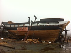
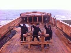
Well, they are! At the Museo Nao Victoria in Chile. You can track progress at the official HMS Beagle Replica website. It’s slow going (having started a couple of years ago) but coming along:

In fact, the Flickr is showing more progress:

Construcción de la réplica del HMS Beagle 321 (1) Construcción de la réplica del HMS Beagle 321 (9)

I can’t quite tell what the plans are once it’s built, and whether it will sail around the world or stay in Chile. A Google Translate of the “Inicio” page says:

Replica 1: 1 HMS Beagle under construction in the city of Punta Arenas - Chile adds a range of activities, is a powerful attraction for the city and the region of Magallanes and can become a landmark worldwide for being the first time you rebuild this legendary ship. The project was established as a multidisciplinary dynamic platform covering tourism, science, education and training The scale replica of HMS Beagle will have navigation capability and this replica reproduces the characteristics that had the HMS Beagle along his second voyage (1831 - 1836), is a private project, so far, no state resources and counts as one form of financing with the resources generated by ticket sales museum admission. The project employs eight people directly, will occupy 240 tons of local wood, and has an estimated 24 months to complete term.

I think that means that it will be seaworthy but whether we’ll have to go to Chile to visit it, time will tell.